And after I redo a piece, even if by simply repainting it, I often wonder what the original owners would think of it now? Sometimes I chuckle to myself thinking these people would flip out if they saw what I just did with their stuff! LOL
Anyways, so on with the entryway. I have been meaning to post this for some time but I kept fussing with the details and felt it was never ready to show but now I'm pretty much done and giving up on making very many more changes at this point.
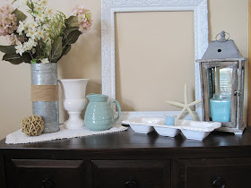
When you walk into our home we have a long wall where we have a sofa table that I change out seasonally. The table is a dark brown/black color with black hardware but I added contrast with light, shabby chich/coastal style accessories. I have had the metal flower bucket for probably 10+ years now and the faded hydrangea stems. To soften up the metal I added a band of burlap around the bucket. I had plans to stensil something on there but for now, it is what it is. The pitcher I bought from AtHome America 4 years ago, the white urn is a thriftstore find, and the lantern I bought from WUSULU about 6 months ago. (see my earlier post).
As for the white linen/runner, it is a napkin that I bought from Pier One about two years ago. It as a beaded pearl border and I absolutely fell in LOVE with it when I saw it! The three sectioned tray in the middle is a chip and dip tray that I used to display some sand and a candle. It too is from AtHome America from about 5 years ago.
Then of course the frame. I was so EXCITED when I found this frame at the GW. It was brown and U.G.L.Y. but I knew I could transform it with a little white spray paint, so it came home with me. It is really ornate and in good shape. I was lucky to have snatched it up when I did!
The three piece serving tray turned candle holder is also full of a lot of ornate design, but in muted tones. Here is one side of the piece that has seashells and the other side in the picture below has a sea hourse.
This picture below is of the bottom shelf of the table. Sometimes I add floral to this lower shelf and sometimes I don't. This time I left the floral out and relied on the texture of the baskets to for interest. The baskets juxtapose the hard surfaces of the glass bottle (which I found at a thriftstore) and the blue ceramic water pitcher.
This pillar top (I think its called a capital...I can't remember...art history classes were way too long ago) but it is a Ballard knock off that I also found at a local thriftstore, and the candle urn is a citronella candle I got on clearance last fall from Pier One for next to nothing. I seriously think I MAY have paid $2 bucks for it. Doncha just love deals like that?!? OH, and I don't burn the citronellain the house peeps....just clarifying b/c there will be someone who will wonder if I do. LOL
Here is another picture of the entire table:
I am happy with the way it all turned out and SUPER excited that I used what I had and the only thing I bought was the candle in the lantern. The rest of the items I had on hand and it was just a matter of pulling it all together.
Tomorrow I will show you the rest of our front room and the summer mantel. Tonight I am hosting this on Cheri's blog hop Its so Very Cheri
Until tomorrow/a la manana,
Jennifer


This is very pretty!
ReplyDeleteBeautiful! I love the colors and textures!
ReplyDeleteI love the colours very beachy!
ReplyDeletei love the blues and creamy whites! so fresh for summer.
ReplyDeleteBeautiful! Thank you for joining me at Home Sweet Home!
ReplyDeleteSherry
I love your vignette. It is so light and fresh looking for summer.
ReplyDeleteBeautiful photos! I have my new condo in philippines and now I know exactly how I put some decorate in it. Thanks for this! :)
ReplyDeleteThank you everyone! I am happy with this vignette and hate to see it go for fall! :)
ReplyDeleteJennifer